

Designing a fertilizer label is much more than creating attractive packaging. A successful fertilizer label must communicate your brand, comply with Canadian regulatory requirements, and help customers quickly understand the product's purpose and benefits. Whether you're launching a new fertilizer, soil amendment, inoculant, or specialty agricultural product, thoughtful label design can make the difference between getting noticed or getting overlooked.
At AgriMark Label Design, we specialize in creating premium agricultural packaging that balances modern branding with the technical requirements needed for Fertilizer Registration. Working alongside regulatory experts such as Agro Certify ensures your label is built correctly from the very beginning.
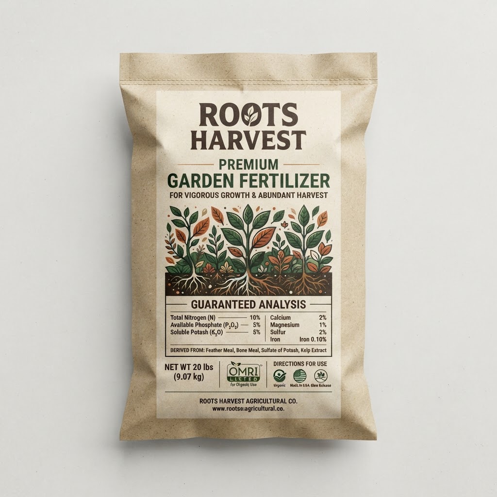
Why Fertilizer Label Design Matters
A fertilizer label is often the first interaction a customer has with your product. Within seconds, buyers decide whether the product appears trustworthy, professional, and appropriate for their application.
An effective fertilizer label should:
- Build confidence in your brand
- Clearly communicate product benefits
- Present technical information in an organized manner
- Meet Canadian Fertilizer Registration requirements
- Stand out on retail shelves and distributor catalogs
- Remain readable across bags, jugs, pails, totes, and bulk packaging
Professional fertilizer label design combines marketing, regulatory compliance, typography, and production knowledge into one cohesive package.
Start With Regulatory Requirements
Every fertilizer label design project should begin with the mandatory information required for Canadian Fertilizer Registration. These elements are not optional—they form the foundation of the entire design.
Typically, required information includes:
Guaranteed Analysis
The guaranteed analysis communicates the nutrient composition of the fertilizer and must be displayed according to regulatory standards.
Product Name
Choose a clear product name that aligns with your branding while remaining distinguishable from other registered products.
Net Weight
The product weight must be clearly visible and appropriately positioned on the label.
Manufacturer Information
Your company name, address, and other required identification information must be displayed clearly.
Registration Information
Depending on the product, registration numbers and additional regulatory statements may also be required.
Starting with these required elements ensures the creative design develops around compliance instead of forcing regulatory information into an already completed layout.
Build Visual Hierarchy Around Compliance
Once the required regulatory fields are established, focus on creating a visual hierarchy that naturally guides the customer's eye.
A well-designed fertilizer label should prioritize information in this order:
- Brand Identity — Your logo and brand should immediately establish credibility and recognition.
- Product Name — The product name should be prominent and easy to locate.
- Primary Benefit — Highlight the main benefit using concise messaging, such as:
- Promotes Root Development
- Improves Soil Health
- Slow Release Nutrition
- High Nitrogen Formula
- Organic Soil Amendment
- Supporting Information — Secondary product features can reinforce value without competing with the primary message.
- Technical Data — Guaranteed analysis, directions, warnings, and registration details should remain organized and highly legible.
A clean information hierarchy improves readability while maintaining full regulatory compliance.
Use Typography That Works in Agricultural Environments
Many fertilizer labels are viewed outdoors, inside equipment sheds, warehouses, or retail stores with less-than-ideal lighting conditions.
Typography should prioritize readability over decoration.
Best practices include:
Use Clear Sans-Serif Fonts
Modern sans-serif typefaces improve legibility at both close and long viewing distances.
Create Size Contrast
Headings, product names, and key benefits should stand apart from supporting information.
Maintain Consistent Spacing
Proper spacing prevents labels from appearing cluttered, especially when technical information is required.
Avoid Decorative Fonts
Script or novelty fonts often become difficult to read once printed on packaging.
Choose Colours That Support Your Brand
Colour psychology plays a significant role in agricultural packaging.
Consider colours that reflect your product category:
Green
Associated with sustainability, organics, and plant health.
Blue
Communicates science, technology, and trust.
Orange or Yellow
Suggests energy, growth, and crop performance.
Black
Creates a premium, modern appearance often used for specialty agricultural products.
A consistent colour palette also strengthens brand recognition across multiple fertilizer products.
Design for Real Packaging
One of the most common mistakes is designing artwork without considering the packaging itself.
Different package types require different design approaches.
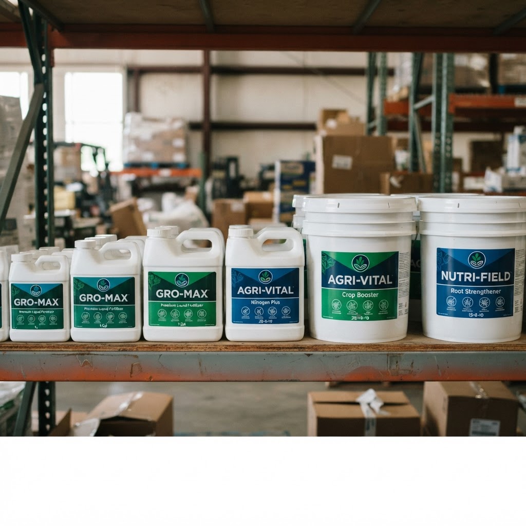
Fertilizer Bags
Large front panels offer strong branding opportunities but require consideration for seams, folds, and stitching.
Plastic Jugs
Labels wrap around curved surfaces and require careful placement of important information.
Pails
Larger containers provide more design flexibility but still require consideration for handles and lid interference.
Totes and Bulk Packaging
Brand visibility often becomes more important since products may be viewed from greater distances.
Professional fertilizer label designers build layouts specifically for each packaging format instead of simply resizing artwork.
Balance Branding With Technical Information
Agricultural products often contain significantly more technical information than consumer products.
A successful fertilizer label separates marketing content from regulatory content without making the label feel overwhelming.
This balance can be achieved through:
- Consistent typography
- White space
- Information panels
- Colour blocking
- Icons and visual dividers
- Clear section headings
The result is a label that feels organized rather than crowded.
Design With Printing in Mind
Even exceptional artwork can fail if it isn't prepared for commercial printing.
Before production, consider:
Print Resolution
Artwork should be prepared at production quality to ensure crisp text and graphics.
Bleeds and Safe Areas
Proper bleed settings prevent white edges during trimming.
Colour Profiles
Use appropriate print colour settings for accurate reproduction.
Vector Graphics
Logos and icons should remain vector-based whenever possible for maximum clarity.
Think Beyond One Product
Many agricultural companies eventually expand into complete product lines.
Designing with a scalable system allows future labels to maintain consistency while remaining easy to distinguish.
A product family might use:
- Colour coding
- Numbering systems
- Consistent layouts
- Shared typography
- Standard iconography
This approach improves shelf recognition while simplifying future product launches.
Partner Early With Regulatory Experts
The best fertilizer packaging projects begin with collaboration.
Working alongside regulatory specialists like Agro Certify from the concept stage ensures your fertilizer label design and Fertilizer Registration submission move forward together instead of becoming separate processes.
Early collaboration helps:
- Reduce revisions
- Prevent compliance issues
- Accelerate product launches
- Improve production efficiency
- Avoid unnecessary design changes after registration review
Integrating regulatory expertise from day one saves both time and money.
Common Fertilizer Label Design Mistakes
Many labels require revisions because of avoidable design issues.
Some of the most common include:
Crowded Layouts
Trying to fit too much information into limited space reduces readability.
Poor Typography
Small or decorative fonts make important information difficult to find.
Weak Brand Presence
Regulatory information is essential, but branding should remain memorable.
Designing Before Registration Planning
Creating artwork before understanding regulatory requirements often results in major redesigns.
Ignoring Packaging Constraints
Labels that look excellent on screen may not translate well to bags or containers.
Why Work With a Professional Fertilizer Label Designer?
Agricultural packaging requires specialized knowledge that combines graphic design, printing, branding, and regulatory awareness.
At AgriMark Label Design, we create fertilizer labels that:
- Meet Canadian industry expectations
- Support Fertilizer Registration requirements
- Reflect modern agricultural branding
- Print accurately across multiple packaging formats
- Build stronger product recognition
- Help products stand out in competitive markets
Whether you're launching a new fertilizer, soil amendment, micronutrient, biological product, or organic input, our team creates labels that are both visually compelling and production-ready.
Ready to Design Your Fertilizer Label?
A professionally designed fertilizer label helps establish trust, supports regulatory compliance, and creates a stronger presence in the agricultural marketplace.
If you're preparing a new product for Fertilizer Registration or refreshing an existing product line, AgriMark Label Design can help create packaging that combines exceptional branding with practical compliance.
Working together with regulatory partners such as Agro Certify, we streamline the process from concept to production so your product is ready for market with confidence.